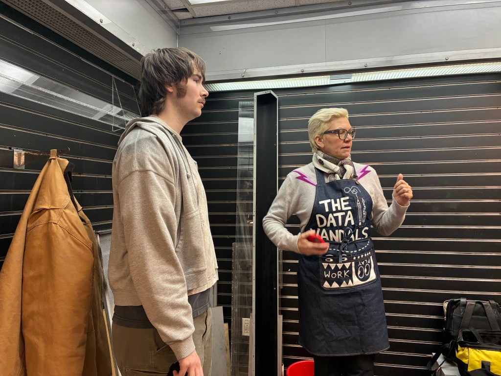
Text and images by Dimuthu Attanayake.
Jen Ray and Jason Forrest are a married couple, both graduates of Winthrop University’s art department in South Carolina, who took wildly different paths after school. Jen stayed in the studio building a career as a contemporary artist. Jason veered into the world of consulting, landing a job at McKinsey, diving into data visualization.
For years, their creative lives ran on parallel tracks.
Then, one day, Jen proposed something nobody in the data visualization world was doing: perform the data. Paint it live. Shout it through bullhorns. Make the audience participate and understand what the numbers mean.
The Data Vandals were born.
It started with an invitation, a pair of bullhorns, and twenty-degree weather on the Lower East Side.
Their debut performance was gloriously chaotic – volunteers shivering on a sidewalk, kids holding up large isotypes and a crowd losing it when they learned that raccoons account for eighty percent of New York’s 311 animal complaints.
Four years and an LLC later, the duo has mounted a sixteen-foot sculpture installation at Union Station in Los Angeles, and wrapped a rented Piaggio in hand-drawn data art through the streets of London.
Most recently, Jen and Jason turned an old newsstand in a Manhattan subway station into a community art space.
How did you two end up making art together?
Jen: We went to art school together. We’re a married couple. Been married a long time. After school, I continued making art as a contemporary artist. Jason went into the corporate world, into data.
Jason: I was a musician first, actually. Then, I got into software and technology around 2008. Had different levels of involvement, and eventually went to McKinsey. That’s where I got into data visualization. Art was completely off the table for me at that point; I was fully corporate.
Jen: But then we got invited to do a project for this exhibition called Data Through Design. They combine art and data, and, every year, the show gets bigger. They basically said, ‘Let’s invite a data person and an art person and see what they come up with.’ So, I said to Jason, ‘Why don’t we perform the data?’ Nobody was really doing that. Why don’t we paint the data? And that one exhibition is what brought us together. We just ran with it.
That first performance on the Lower East Side, what did it actually look like?
Jen: We created these large isotypes and lined people up to show different things about food culture, quality of life in New York. It was really humorous. We treated it as very funny; we had bullhorns, we were asking the audience for their opinions. We always wanted to make things where we connect with the audience and they connect back. We learn from them, they learn from us. That’s our philosophy.
Jason: It all started with that one project, then another and another. Now we’re four years in. We have an LLC. We do projects that are taking us around the world. But we’re still New York-based, and we still want to find ways to speak to the city, to have a conversation with the city. That’s our mission.
When you first got into creating art from data, how did you reconcile being artistic with being accurate?
Jason: This is where our work gets really different. Jen sees it very much as an art project. I see it very much as a data project. It’s about figuring out the balance. Sometimes she’ll do a design that doesn’t have much data and it doesn’t look as good. Sometimes I’ll do something with too much data and it doesn’t have that spark. When you balance the two, that’s when it becomes really interesting.
Jen: It’s true. But we both went to art school. I studied drawing, printmaking and painting. Jason studied new media and photography. So he understands the vocabulary of art. He’s not coming in cold like some business person. He comes from the artistic side, too, even though he went into another field. We are both really inspired by people who used art to explain data in the 1920s and ’30s. They gave us an entry point.
What kind of feedback did you get from that first audience? When did you know it was working?
Jason: We didn’t really know what we were going to do. It was a performance with all these icons, and it was crazy cold. It was hard.
Jen: When you hear “March in New York” back in January, you think it’s going to be warm. It was twenty degrees.
Jason: We wanted people out in the street. We had thirty or forty volunteers, maybe fifty or sixty people on the sidewalk, all these kids involved. It was a big mess, handing out pieces of cardboard, getting everyone in place. Then Jen went up and asked the audience, ‘What animal are New Yorkers most afraid of?’ People started shouting their ideas.
Jen: A lot of our data comes from New York City’s open data portal. We knew the answer from 311 data, where people report animals roaming free. And it’s raccoons; 80 percent of all calls. Not by a slim margin. Eighty percent. And I know that’s factual because I was walking in Central Park with some friends, and I’m from the countryside, so I saw a raccoon and thought it was cute. I looked back and my friends who were native New Yorkers were terrified.
Jason: So we realized that’s what we wanted to do – ask questions that were grounded in the data. We knew the answers. We weren’t just riffing. And that opened up this whole approach of making data surprising and fun, but always factual.
You mentioned the data doesn’t always say what you expect. Can you give an example?
Jen: We’re doing a project now with the city about New Yorkers’ favorite foods. But the data we have is licensing data for restaurants — health inspections. Every restaurant has to get a license and declare what food they serve. So you get a map of, like, what are the restaurants in Queens? What’s the most popular cuisine in Brooklyn? Maybe you’d say pizza. But maybe it’s not. How do we present that in a way that’s funny and interesting?
Jason: There’s a lot of interesting aspects to data, even when it’s collected for a completely different purpose. In this case, we are using health inspection data for every restaurant, but there’s a field for the type of food. So it becomes a kind of map for certain types of cultures across the city.

Leave a comment